Showing posts with label learning to understand the art world. Show all posts

Tuesday, March 17, 2015

An Original Painted Mural for the School- From Start to Finish


To begin the process, students in Honors Painting visit the sight where the future mural will exist. 


They discuss some aspects of the space that might evoke imagery, and then get to work sketching anything and everything that comes to mind. 


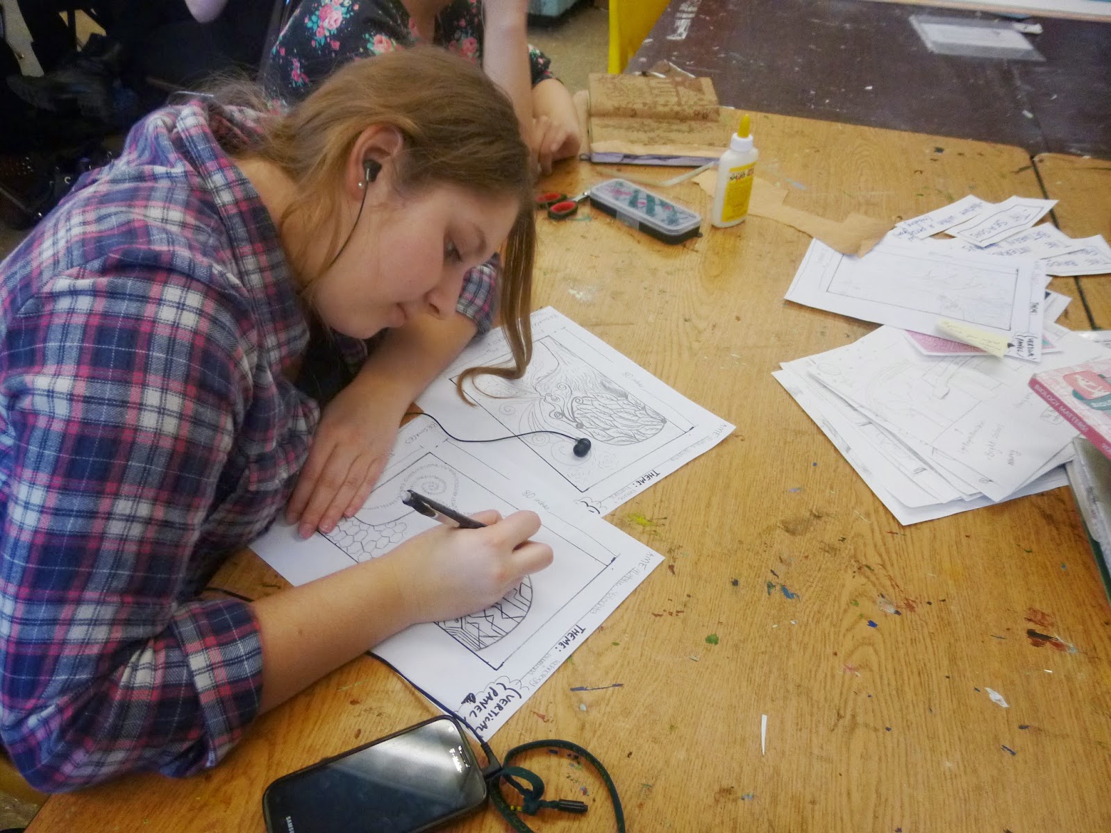
Next students refined their ideas and drew them to scale for one of the horizontal or vertical panels.  They also wrote a statement about their idea/drawing so that their peers could understand their intent.

Next, myself and the students worked together to lump the individual designs into overall categories in order to discover common trains of thought.  


After looking at all the drawings and reading the statements. Students then divided into teams, based on their interest in one particular theme.  Some teams were large and others were only pairs of students.  They worked with the drawings that had already been created, to try and compose 2 vertical and 2 large horizontal panels.


The students then presented the drawings for all 4 panels and we discussed their strengths and weaknesses both in imagery and in idea.


Finally, through a voting process and a discussion, we were able to narrow down to 4 main drawings/plans.  We audio recorded each pair of student-finalists explaining their idea and why they felt it should be chosen. After listening to the presentations, the principal and assistant principal met with Ms. Wain and I to select what might be the best idea. Here are some of the final sketches that were presented, still in a rather rough state in ways.


 Students work together to sand the large wood panels and paint them with an undercoat of gesso.


After the final sketches are traced onto transparencies, students use overhead projectors (technology that is not obsolete!) to enlarge the drawings and trace them onto the large panels using watery paint.  We decided against charcoal since it smudges so much.

Students then begin filling in large sections of color, referencing a pattern book of traditional clothing from around the world.  


I should explain that each large shape in the mural is the silhouette of a different Chicago sculpture.  The colored lines represent the train lines that all converge downtown (near the lake).  Each sculpture is filled with a pattern that represents traditional clothing from a different ethnic group that resides in Chicago and attends school at Lane Tech! The green shapes behind the train lines and sculptures represent the geographical shapes of different Chicago neighborhoods.  This is some deep context and imagery!


Can you see the reversed silhouette of the Alexander Calder sculpture above in the mural panel below?


 The students rotated in groups, alternating between painting on the mural panels and working on their own independent project of their choosing.  This helped keep chaos at bay and kept the students interested for longer. 


The colors we used were predetermined and students had to spend a lot of time referencing original patterns in order to figure out what colors to employ.  The mural became much like a giant, detailed coloring book with oh so many details. 

 
The faces on opposite panels are of Dinah Washington and Muddy Waters, who represent the Chicago music scene and the rich history of the arts we have in Chicago.


This is the hallway where the panels lived when my painting class was not in session.  I do not miss carrying these heavy boards in and out of the classroom every day for 4 months!
  

Ready to hang pretty much... I may have done lots more meticulous edging after the last school-day ended!


Below are the colorful finished mural panels, all hung up and looking great.  This is the only stairwell in Lane that has a mural, and these murals are the only permanent student art up in the hallways so far.  I am proud!


The original designers of this concept, Josef and Paula stand in front of a final product that does indeed resemble their first sketches. 


This was really a fantastic experience.  I learned a ton and am really proud of the fact that this huge mural was born completely of students' original ideas and cultivated through a democratic process. 


Sunday, August 24, 2014

Relief Printmaking with Linoleum

 In the spring, students learned about the process and techniques associated with relief printing.  To begin, I passed around some different prints and plates that helped to explain just how many different types of printmaking are out there.  We a bit talked about the style and history of wood cut and how linoleum carving came about. 
Next, students practiced carving on scrap pieces of linoleum that were painted black with ink so that they could see the difference between each gauge and the type of mark/cut it made.   Students also drew simple black and white designs on stamps and practiced carving around those. 


 I have always liked alphabet books because they come in so many different themes and often have unexpected images.  After looking at the beautiful paper cuts in this alphabet book, Awake to Nap, I became inspired to have the alphabet book be the thing that linked all of the student images together.   Students were then introduced to the concept and were told that their prints would be bound into a book at the end of the year (I'm working on it!)  Every student could carve what they wished as long as it was linked to the letter they randomly selected.


Your fate awaits you... what letter of the alphabet will you select from the basket with your eyes closed?

 After choosing a letter of the alphabet, students brainstormed and sketched several possible ideas for homework.  I tried to stress that the letter was merely a point of inspiration and that they could really make any image fit using a sentence.  A strong composition was a must.


Students spent some time planning out what would be carved and what would remain by using marker or pencil in their sketchbook.  This process helped them visualize how the black and white shapes would fit together.  They then transferred their image onto the linoleum and once again filled in the areas that would remain un-carved with marker.


"C" is for cupcake

"T" is for tea
 
  
I encouraged students to begin carving their final image only when they felt confident with carving.  In the meantime, they continued practicing with the stamps. I didn't take a lot of pictures of the carving process because I was constantly walking around the room making sure that students were not carving towards their fingers!

"U" is for unknown
 

 Students were required to try and make an edition of 3 prints, in black and white, that looked exactly the same.  This meant controlling for so many variables, such as amount of ink, amount of pressure, dryness of ink, borders, smudges, etc.  Students really gained an appreciation for how tough a small edition is to pull off, let alone an edition of 100!  After students completed their edition in black (for the most part),  it was time to become more experimental.  I showed them several techniques such as the rainbow roll and how to cut a stencil/mask certain areas in order to have certain areas of the image be one color, and other areas another.  Each time a student created a print using a "new" type of experimental print, I pinned it to a board around the classroom so that the other students would have a gallery of possibilities to peruse.  Citing Andy Warhol as an example, I challenged them to create prints that really had a different mood from the original or that even subverted the meaning of the original.


Some examples of types of experiments are printing on a collages background or colored piece of paper, painting back into an old print using watercolor, using more than one color in a print, masking, rainbow roll, double registration, purposeful mis-registration,  repeating the image many times, using masking tape to block out shapes, collaging back into a print, and more.

  
As far as what to turn in for the project grade, the students were asked to have 3 edition prints that looked almost exactly alike, and 5 experimental prints that exhibited at least 3 different techniques.
Throughout the printing process there were so many prints lingering in and around the classroom.  4 classes were printing all on the same day for at least 6 days in a row.  We sure did go through a lot of paper.


 We had plexiglass for colored inks and plexiglass for black ink only.

 As a final step in learning about the printmaking process and about the world of the artist, students signed their prints according to the traditional way to do so, and they looked through all of their many prints to select their best work.   Many prints were in many boxes, on the drying racks, etc.  It took each person a long time to find ALL of their work.


"F" is for farwell


When I asked the students how they felt about this project on their end of the year survey, many said they enjoyed carving and they liked some of their prints, but that overall they found it frustrating as a process because it was so messy (with 30 artists printing at the same time!) and because they found it very challenging to make prints that look the same.   I think if I do this project again, I will have better systems in place to try and curtail the mess and keep all of those prints organized, as well as maybe requiring less prints for the grade.  Many of the prints are really unique and beautiful, and the concept of altering one image to create different moods and imply many meanings is an important one to explore.